Below is a short video demonstrating a dynamic interface for doing basic accounting. The objective was/is to categorise line items to make them easier to display and work with based on classification. This can be done manually or the system can be trained to automatically classify items. You can dynamically choose the level of line items you want to display and similarly choose what items are to have notes in a printed report. In addition to this level of automation you can generate automated reports and save the key ingredients of the displays as a CDF.
If you encounter any problems with the embedded link below -- which is best viewed in full screen mode -- then click here for full video
The classification of line items can be done manually, and must be initially, but after initial classification machine learning code can automatically classify line items and assign a probability -- with colour code for easy identification and inspection. The combination of line item classification and the dynamic interface means items can move automatically based on their balance. For example if a bank balance becomes negative, rather than remain as a negative asset the line item automatically moves to the liabilities section of the balance sheet where it appears as an overdraft. Ditto movement of payables/receivable line items.
If you encounter any problems with the embedded link below -- which is best viewed in full screen mode -- then click here for full video
A full transaction record is kept along with notes for each transaction which are shown as tooltips for easy access.
If you encounter any problems with the embedded link below -- which is best viewed in full screen mode -- then click here for full video
Sunday, 5 October 2014

Saturday, 6 April 2013
Interfaces in Mathematica
An example of a flexible interface with tab buttons in the docked cell at the top of the notebook.
Opening display

Import some data using the import wizard. Selected columns chosen for importing are highlighted:


Style the data:

Thursday, 7 February 2013
Automatic report generation: part 4
This is the fourth of three posts (!) that show how Mathematica can automate the processing of data -- an addendum that shows some newly created features.
The new feature added is a function to compare various periods: month vs month, quarter vs quarter, calendar/financial year vs calendar/financial year, and year-to-date vs year-to-date.
Note that the recording was made on a 7 year old 32 bit computer (running Mathematica V8) and some of the operations shown were slowed down by having to run the recording.
The key take home message I'd like viewers to get from both these posts and the rail freight post is that mundane data processing tasks can be automated. It doesn't matter what format your data is in, as long as the format is coming consistently your data processing can be automated. Additionally this could be taken a step further can all be done in the background and scheduled to run as given times -- but there would be no video to show in that case!
This video is best viewed in full screen mode.
Wednesday, 6 February 2013
Point and click "Tableau-like" visuals in Mathematica: Part 2
This video shows an interactive application that displays Excel data -- although the source could be any of a wide variety of formats. Some dummy data on house sales activity is imported and displayed. The user chooses the locality they want to focus on and can adjust the viewing period. The bubble chart shows fraction of pending sales over the viewable period.
A more advanced version would link to e.g. Google Maps to display the location data automatically.
Note that the recording was made on a 7 year old 32 bit computer (running Mathematica V8) and some of the operations shown were slowed down by having to run the recording.
The key take home message I'd like viewers to get from this and other similar posts is that mundane data processing tasks can be automated. It doesn't matter what format your data is in, as long as the format is coming consistently your data processing can be automated.
This video is best viewed in full screen mode.
A more advanced version would link to e.g. Google Maps to display the location data automatically.
Note that the recording was made on a 7 year old 32 bit computer (running Mathematica V8) and some of the operations shown were slowed down by having to run the recording.
The key take home message I'd like viewers to get from this and other similar posts is that mundane data processing tasks can be automated. It doesn't matter what format your data is in, as long as the format is coming consistently your data processing can be automated.
This video is best viewed in full screen mode.
Wednesday, 23 January 2013
Automatic report generation: part 3
This is the third of three posts that show how Mathematica can automate the processing of data.
1. This video shows the presentation of the data as bar charts.
2. Some styling options are shown.
3. Bar charts can be toggled to show, for example, monthly, quarterly, and annual data.
Note that the recording was made on a 7 year old 32 bit computer (running Mathematica V8) and some of the operations shown were slowed down by having to run the recording.
The key take home message I'd like viewers to get from both these posts and the rail freight post is that mundane data processing tasks can be automated. It doesn't matter what format your data is in, as long as the format is coming consistently your data processing can be automated. Additionally this could be taken a step further can all be done in the background and scheduled to run as given times -- but there would be no video to show in that case!
This video is best viewed in full screen mode.
Automatic report generation: part 2
This is the second of three posts that show how Mathematica can automate the processing of data. This video shows some of the plotting features that are possible once the data has been processed.
1. Plots can be toggled to show, for example, monthly, quarterly, annual, and seasonal data.
2. Where a category that is plotted has nested line items a drill down button allows the break down of the line item to be shown.
3. Notes can be added to plots.
4. Underneath the plot the category being plotted is tabulated as a percentage of other categories/line items.
5. Plots, tables, and notes can be saved as PDFs for distribution among colleagues.
Note that the recording was made on a 7 year old 32 bit computer (running Mathematica V8) and some of the operations shown were slowed down by having to run the recording.
The key take home message I'd like viewers to get from both these posts and the rail freight post is that mundane data processing tasks can be automated. It doesn't matter what format your data is in, as long as the format is coming consistently your data processing can be automated. Additionally this could be taken a step further can all be done in the background and scheduled to run as given times -- but there would be no video to show in that case!
This video is best viewed in full screen mode.
1. Plots can be toggled to show, for example, monthly, quarterly, annual, and seasonal data.
2. Where a category that is plotted has nested line items a drill down button allows the break down of the line item to be shown.
3. Notes can be added to plots.
4. Underneath the plot the category being plotted is tabulated as a percentage of other categories/line items.
5. Plots, tables, and notes can be saved as PDFs for distribution among colleagues.
Note that the recording was made on a 7 year old 32 bit computer (running Mathematica V8) and some of the operations shown were slowed down by having to run the recording.
The key take home message I'd like viewers to get from both these posts and the rail freight post is that mundane data processing tasks can be automated. It doesn't matter what format your data is in, as long as the format is coming consistently your data processing can be automated. Additionally this could be taken a step further can all be done in the background and scheduled to run as given times -- but there would be no video to show in that case!
This video is best viewed in full screen mode.
Automatic report generation: part 1
This is the first of three posts that show how Mathematica can automate the processing of data. In this example the data is in the form of Excel spreadsheets. A previous example showed importing data from a PDF.
I haven't added a voice over so a few points to note:
1. The Excel files are generic balance sheets and P&Ls. Each file containing a separate worksheet for a given month.
2. The display objective is to nest different categories. So the first step is to establish a parent-child relationship. For example current assets is a child of assets. This relationship is stored so it only has to be done once.
3. The nesting allows the user to determine the level of drill down they want to display in the accounts.
4. The raw data for this example was monthly data. Once imported and processed the user can toggle between monthly, quarterly, calendar year, financial year, and year-to-date for presentation purposes.
Note that the recording was made on a 7 year old 32 bit computer (running Mathematica V8) and some of the operations shown were slowed down by having to run the recording.
The key take home message I'd like viewers to get from both these posts and the rail freight post is that mundane data processing tasks can be automated. It doesn't matter what format your data is in, as long as the format is coming consistently your data processing can be automated. Additionally this could be taken a step further can all be done in the background and scheduled to run as given times -- but there would be no video to show in that case!
This video is best viewed in full screen mode.
I haven't added a voice over so a few points to note:
1. The Excel files are generic balance sheets and P&Ls. Each file containing a separate worksheet for a given month.
2. The display objective is to nest different categories. So the first step is to establish a parent-child relationship. For example current assets is a child of assets. This relationship is stored so it only has to be done once.
3. The nesting allows the user to determine the level of drill down they want to display in the accounts.
4. The raw data for this example was monthly data. Once imported and processed the user can toggle between monthly, quarterly, calendar year, financial year, and year-to-date for presentation purposes.
Note that the recording was made on a 7 year old 32 bit computer (running Mathematica V8) and some of the operations shown were slowed down by having to run the recording.
The key take home message I'd like viewers to get from both these posts and the rail freight post is that mundane data processing tasks can be automated. It doesn't matter what format your data is in, as long as the format is coming consistently your data processing can be automated. Additionally this could be taken a step further can all be done in the background and scheduled to run as given times -- but there would be no video to show in that case!
This video is best viewed in full screen mode.
Monday, 3 December 2012
Point and click "Tableau-like" visuals in Mathematica
Tableau is a dominant software for data visualisation. Since about 2009 I have been suggesting Wolfram Research offer a Tableau-like interface for data visualisation. Tableau comes in many forms but includes a web plug-in and an iPad version. Some examples of the visuals can be found here.
As nice as the visuals are there doesn't seem to be anything that couldn't be built with Mathematica. The point lost on many seems to be that commercial users are time poor and do not want to be spending enormous time creating these things -- particularly when an off-the-shelf alternative like Tableau or Spotfire exists. Nevertheless, for the curious, some crude "Tableau-like" functionality can be put together fairly quickly.
Below is a video showing one such feature. The user (left) clicks on a point and a navigation box appears from which they can exclude the point, keep only the point or open a window showing all the data. This window with the data is very crude-- for this exercise I didn't see any point in styling it. Right clicking anywhere in the plot reverts to the original set of data. This sort of feature could be applied to bars, columns, lines and so on.
I didn't take any time to adjust the color function so you will see that as points are excluded the colours change. These sorts of things can easily be corrected. Additionally the navigation box can include functions which link to other coupled plots but for now that is as far as I have gone. I might have a go at making a complete Mathematica version of one of the Tableau examples one of these days.
The video is best viewed as full screen.
And another video:
As nice as the visuals are there doesn't seem to be anything that couldn't be built with Mathematica. The point lost on many seems to be that commercial users are time poor and do not want to be spending enormous time creating these things -- particularly when an off-the-shelf alternative like Tableau or Spotfire exists. Nevertheless, for the curious, some crude "Tableau-like" functionality can be put together fairly quickly.
Below is a video showing one such feature. The user (left) clicks on a point and a navigation box appears from which they can exclude the point, keep only the point or open a window showing all the data. This window with the data is very crude-- for this exercise I didn't see any point in styling it. Right clicking anywhere in the plot reverts to the original set of data. This sort of feature could be applied to bars, columns, lines and so on.
I didn't take any time to adjust the color function so you will see that as points are excluded the colours change. These sorts of things can easily be corrected. Additionally the navigation box can include functions which link to other coupled plots but for now that is as far as I have gone. I might have a go at making a complete Mathematica version of one of the Tableau examples one of these days.
The video is best viewed as full screen.
And another video:
Saturday, 24 November 2012
Railfreight analysis
A slightly better quality video of my interface to my North American rail freight (MySQL) database described here. I have since changed the graphics and now use interactiveDateListPlot.
Note that the recording was made on a 7 year old 32 bit computer (running Mathematica V8) and some of the operations shown were slowed down by having to run the recording.
Best viewed in full screen mode.
Note that the recording was made on a 7 year old 32 bit computer (running Mathematica V8) and some of the operations shown were slowed down by having to run the recording.
Best viewed in full screen mode.
Wednesday, 7 November 2012
Dynamic Grids
I've been developing some grids that have some dynamic features that make them more useful than static grids. In the video below you will see a grid that behaves similarly to an Excel spreadsheet with frozen panes. The main difference is the use of openers to nest line item categories. In the video I have replaced actual data with random line item names and random numbers. The actual usage is for each nested child category to add to its parents total. The parent totals are displayed and when you click on the openers the child line items are displayed.
Best viewed in full screen mode.
Best viewed in full screen mode.
Wednesday, 27 June 2012
Easy button to switch between `Working` and `SlideShow` Screen Environments
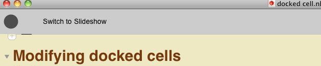
There was a question here about having a button in a docked cell to switch between the Working and SlideShow environments in Mathematica. In the notebook linked at the bottom there is code to generate a docked cell that allows you to toggle between the Working and SlideShow environments and also allows to to run the Working environments in full screen mode.


There are instructions on how to turn this into a stylesheet. You can download the Mathematica notebook here.

There are instructions on how to turn this into a stylesheet. You can download the Mathematica notebook here.
Legend positioning
Problem: I want to be able to fine tune the positioning of my plot legends.
Solution: Use the legends as a Locator in Mathematica.
Second problem: I want to position the legend outside the graphic. It is easier to use scaled points for locator positioning and these work within the plot.
Solution: Surround your actual plot with an empty graphic that acts as a canvas
Below is an example using a toy legend.
The Mathematica notebook can be downloaded here.
Solution: Use the legends as a Locator in Mathematica.
Second problem: I want to position the legend outside the graphic. It is easier to use scaled points for locator positioning and these work within the plot.
Solution: Surround your actual plot with an empty graphic that acts as a canvas
Below is an example using a toy legend.
The Mathematica notebook can be downloaded here.
Thursday, 7 June 2012
Tabbed content
TabView is good for prototyping interfaces but when deploying you ideally want to make things look a bit better. Here is an example of Mathematica tabs built from the ground up from graphics primitives and event handlers. The application is the creation of a step by step wizard.
(note that the compression used in the video creation hasn't done the crispness of this interface any favours)
(note that the compression used in the video creation hasn't done the crispness of this interface any favours)
Thursday, 5 April 2012
Digitizing plots
I recently replied to a question on Mathematica Stack Exchange about digitizing plots. I've added a bit more code to that answer and created a tabbed interface for digitizing plots.

You can download it here. Feel free to make modifications.

You can download it here. Feel free to make modifications.
Monday, 26 September 2011
Creating "margin" graphics, custom dingbats, and docked cells
During a discussion on LinkedIn: "Anyone writing journal papers and theses using Mathematica?" one of the questions raised was how to have text floating around graphics. I don't have an easy answer for that but one of the other features you often see in textbooks is wide page margins that contain pocket graphics. You can implement this in Mathematica by placing the graphic in the CellFrameLabel. Here is an example:

The notebook describing how to do this can be downloaded here.

The notebook describing how to do this can be downloaded here.
Saturday, 17 September 2011
Interactive Plot Ranges in Mathematica
If you've used things like InteractiveTradingChart in Mathematica you may have wondered why that sort of dynamic interactivity isn't an option for other plot and chart types. I've made a function called interactiveDateListPlot to do this using sliders and locators.
The code for interactiveDateListPlot can be downloaded here. This code was for DateListPlot but interested Mathematica users will be able to extend this to other plot types.
The code for interactiveDateListPlot can be downloaded here. This code was for DateListPlot but interested Mathematica users will be able to extend this to other plot types.
Wednesday, 14 September 2011
Test post
Test post to see if I can embed CDFs without any problems ...as described here. I've found that this can sometimes take awhile to load even though the file is 4KB.
The CDF being displayed here is located at my Dropbox. Additional material on embedding CDFs can be found at Walking Randomly.
The CDF being displayed here is located at my Dropbox. Additional material on embedding CDFs can be found at Walking Randomly.
Thursday, 21 July 2011
Example of an Enterprise Level Asset Pricing Tool
I recently made an enterprise level asset pricing tool or "dashboard" for a company, that allows users to price assets and obtain other financial metrics without having any Mathematica experience (or even realizing that Mathematica is what they are using). A brief summary of the dashboard:
GUI for asset pricing and analytics, database management, and workflow management built using a combination of Mathematica and SQL languages.
Dynamic Monte Carlo (random numbers sampled from a distribution customized for each asset) & probabilistic asset price modeling using data accessed from the MySQL database; Discounting via either fixed rates or spread to the treasuries rate curve.
Here are some screen grabs of the dashboard. Due to the nature of the project there are limits to what I can display so several tabs in the dashboard aren't displayed or are displayed in a limited way with some pixelation to conceal proprietary information.

Pricing and data retrieval and storage can be scheduled.

Bond yields are obtained from Bloomberg and stored in the company database and retrieved from within the dashboard.
GUI for asset pricing and analytics, database management, and workflow management built using a combination of Mathematica and SQL languages.
Dynamic Monte Carlo (random numbers sampled from a distribution customized for each asset) & probabilistic asset price modeling using data accessed from the MySQL database; Discounting via either fixed rates or spread to the treasuries rate curve.
Here are some screen grabs of the dashboard. Due to the nature of the project there are limits to what I can display so several tabs in the dashboard aren't displayed or are displayed in a limited way with some pixelation to conceal proprietary information.

Pricing and data retrieval and storage can be scheduled.

Bond yields are obtained from Bloomberg and stored in the company database and retrieved from within the dashboard.
Sunday, 19 June 2011
Styling Tables in Mathematica
The video demonstrates some code I have written to make styling tables a little bit easier.
Code for styling tables can be downloaded here. This is "scaled down" code that is not as elegant IMO as that used in the video but probably more straight forward to follow. The video code is primarily based on TaggingRules.
Code for styling tables can be downloaded here. This is "scaled down" code that is not as elegant IMO as that used in the video but probably more straight forward to follow. The video code is primarily based on TaggingRules.
Saturday, 18 June 2011
Data processing with Mathematica and MySQL
Example of a small database driven application. Data, in the form of PDFs, are imported into Mathematica, scraped, and the data displayed. If the scrape was error free the data is saved to a MySQL database. Errors can be edited and then data saved.
The other part of the application is retrieving data from the database on the fly and displaying it.
The other part of the application is retrieving data from the database on the fly and displaying it.
Subscribe to:
Posts (Atom)